|
Evaluation
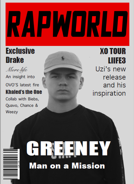
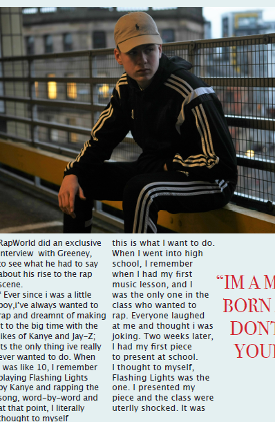
In what ways does your media product use, develop or challenge forms and conventions of real media products? My media product conforms to a lot of the XXL Magazine features including the masthead and the way in which the title is presented on the front cover. I decided to stick with the same colour scheme as XXL as I thought that this is one of the main features. I also stuck to the colour scheme of black and white which also sticks with the theme of XXL. However, I did change the way in which the picture was presented. Most of the XXL magazines contain a blank background whereas mine contain a background. How does your media product represent particular social groups? My media product successfully represents certain social groups by interviewing relative music artists who would be familiar with the genre. I included an article about aspiring rap artists who started from the bottom and I feel that this could certainly appeal to an audience who may also be aspiring to achieve what my artist had done. What kind of media institution might distribute your media product and why? An independent company with an interest for the rap scene may have an interest in distributing my magazine. Furthermore, my product may be distributed online to suit the needs of an audience who may prefer to use the web to read and to reach a broader audience. Who would be the audience for my media product? I would say that my magazine may have a range of different audiences. This may include older teenagers, mature adults, and most definitely people with an interest in Rap. Furthermore, the product may appeal to inner city individuals perhaps with an urban background. How did you attract/address your audience? I used realistic rap artists to attract an audience with specific artist interests and use simplistic colour schemes (black and white) to add detail and character to my magazine. I also used clothing in which is relative to the genre in which also applies to the audience. What have you learnt about technologies from the process of constructing this product? I have managed to learn new software from across different platforms such as Adobe InDesign and Photoshop. These were the software’s in which were used to produce and assemble my product. As well as this using this, I used Weebly to post my progress on the production of my media product. Looking back at your preliminary test, what do you feel you have learnt in the progression from it to the full product? From looking back at the preliminary task, I have now used much more advanced software such as InDesign and Photoshop rather than Publisher in which was used to create the first task. InDesign has given me a broader knowledge on how to assemble a piece for a production while Photoshop taught me how to firstly, remove backgrounds and add adjustments to my work. Whilst constructing my front cover, I was undecided on where to position my artist name on the front cover. I was worried that it may interrupt the models clothing. I gathered thoughts from other individuals so that I had a range of views on my cover. 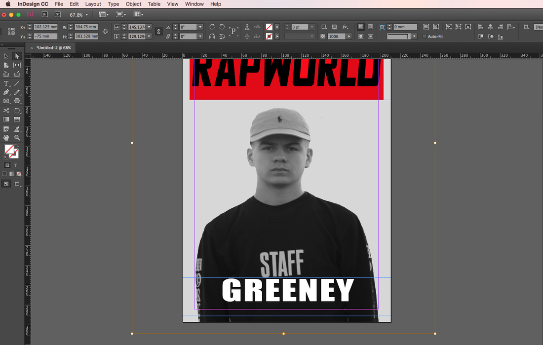 This is the cover with my artist name set just under the "staff". I had feedback saying that it looked like it read "staff greeney". This could be confusing to my audience. I then decided that the cover may look better with the artist name placed over the "staff". This is how it looks: 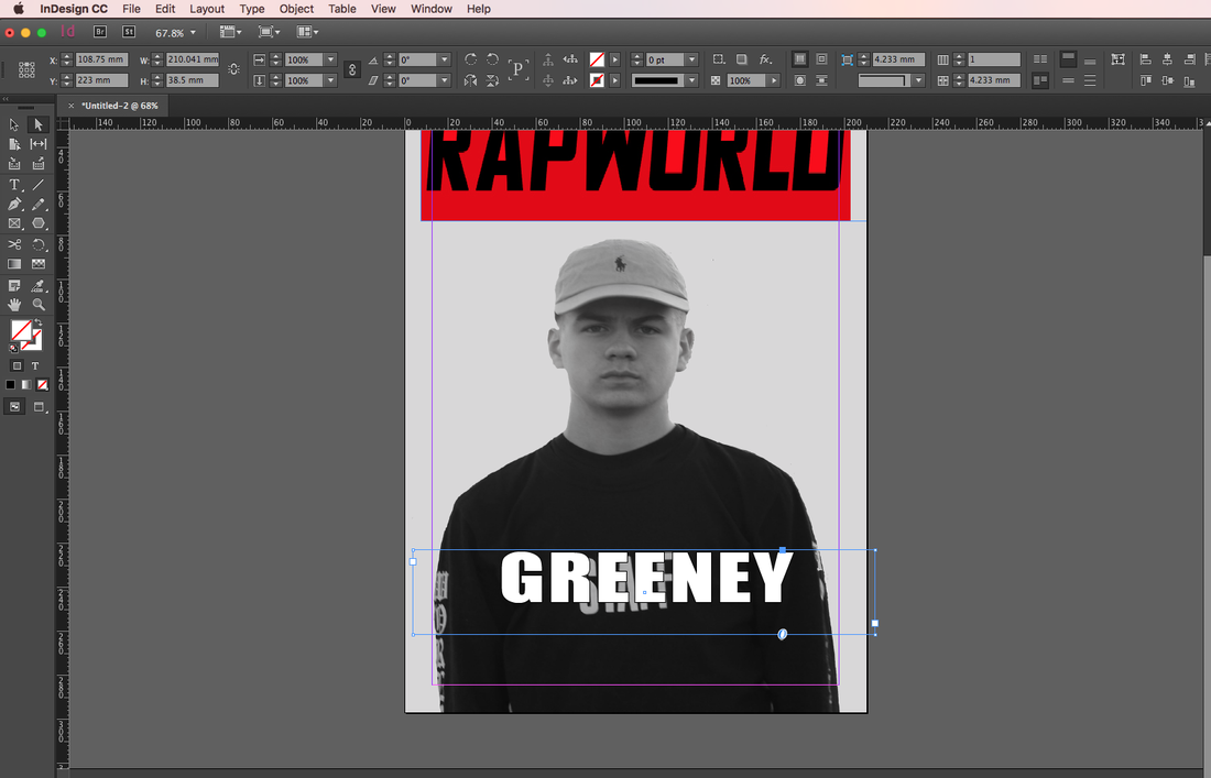 This is the cover with the artist name over the models clothing. I received mixed views with people saying that it is hard to read with the "staff" underneath while some people said that it masked the clothing so that it was easier to read and understand.
   I have narrowed down the process of choosing a name for magazine to 3: Rap Mag, Rap Scene and Rap Worldwide. My intention was too keep the name short and snappy so that it appealed to the public. I also decided that it would be particularly important to include the word "Rap" as it highlights the genre and would help promote the magazine to its target audience.
     I have gathered some example fonts in which have appealed to me. I have used DaFont.com to give me an idea of what the masthead on my magazine could potentially look like.
 Colour Scheme: Colour scheme is an important aspect of this double page spread. Straight away when we look at the double page spread, we are hit with the prominent colour of red which is highlighted on both pages. On the left side of the double page spread, we are given a powerful image of Jay-Z which features a half red, half white background which covers the rappers face. The red is again used in the quote situated to the right of the rapper. On the right side of the double page spread, red is again used in the “J” which obviously signifies the rappers name. Why red? Red is a colour which we may associate with power, dominance and possibly anger. Due to the way people interpret the rap culture, I feel that the red in which is used fits in perfectly with the genre and certainly helps the double page to stand out.
Image: Similar to the contents and double page spread, the page consists of the artist. The way in which Jay-Z is positioned and used is quite powerful as I feel that you almost connect with the artist due to the way he is looking. This is intended to almost provoke the reader and help them to get on terms with the story. As well as this, many people tend to look at the pictures in magazines and by making one page exclusive to the image, this really helps people who may not like to read the information. Text: the text is kept to the right hand side of the double page spread and contains the main piece of the spread. The right hand side provides us with a story behind the artist which is featured on the left side by the image. At each paragraph, the first letter is superimposed over the other text to focus the reader. Fonts are changed sparingly through both pages and are not jumbled up. re to edit. Layout for the Front Cover 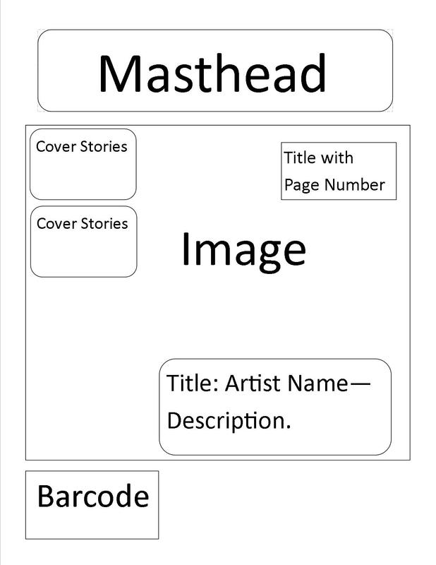 I have designed this layout for my front cover so I can get an idea of how the cover may look when completed. I have tried to fit the design In with the conventions of the XXL magazine. However, I have tried to input my own ideas to try so that it has my own influence.
|
Greg Turner
Presenting blogs for my AS Level Media. 
|